Case Study
Tapperhet
Tapperhet
Cooking
"Bravery Cooking" — Redefining the culinary learning experience for men through a bold, character-driven visual system and utility-focused UI.
Objective
Establish a unique brand voice in the saturated "cooking app" market to target male users.
ROI
25% month-over-month growth since launch through highly qualified leads.
Community
Created a distinct sub-culture of "Brave Cooks," raising the average ticket.
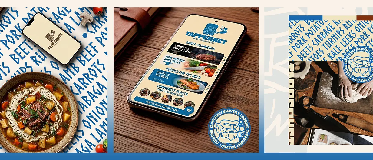
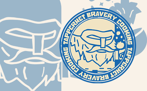
Visual Identity.
The identity centers around a rugged "Viking Chef" mascot, combined with a high-contrast blue and cream palette.